foreword

Hey, there! This isn't the first page you should be visiting. A better intro to our mission, who we are, and our story is found at identity.

photos and interaction


Graphic Elements


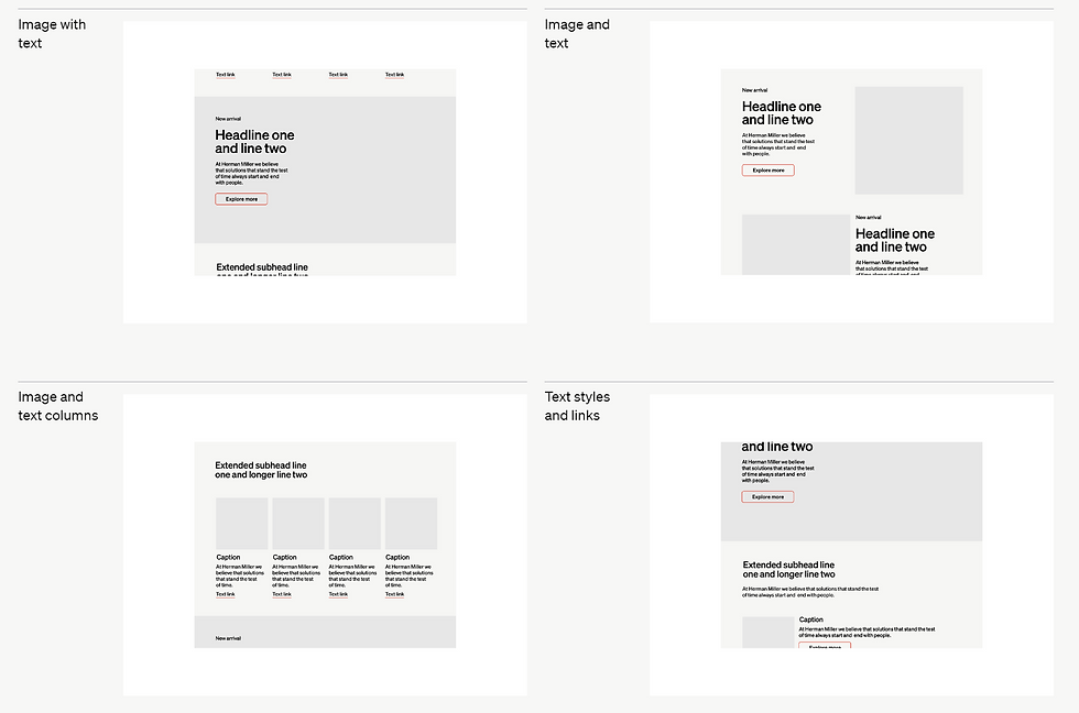
Graphic elements are used throughout our visual system to support elements like typography, color, and our identity. By using clear and recognizable imagery, they can structure information and create visual interest while adding to the legibility of a composition.


Buttons


All buttons should maintain a uniform style across the web application to support brand consistency. This includes consistent use of color, font, size, and shape. The deep blue hue and rounded corners associated with the FDRMUN brand should be applied uniformly to all buttons to reinforce brand recognition. We always adhere to Web Content Accessibility Guidelines (WCAG) to ensure buttons are navigable and usable by individuals with disabilities. This includes providing alternative text for screen readers and ensuring keyboard navigability.
See General Assembly 1 ↗


We make sure that our Web designs adhere to the WCAG. FDR prioritizes accessibility for all.


Photography


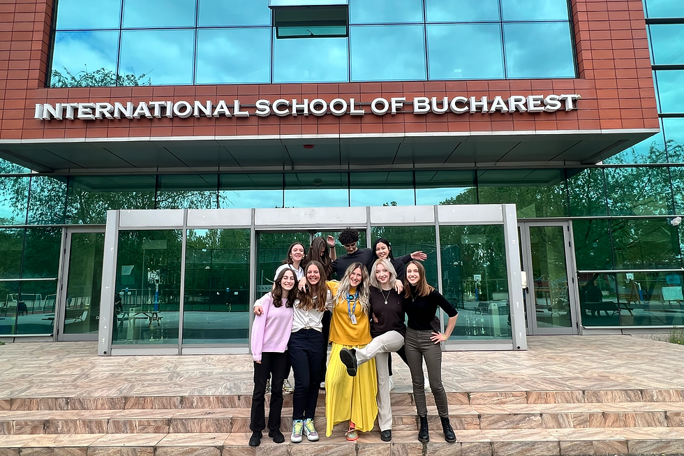
When taking photos, there should always be a single or composite subject. Photos must gravitate to a hue (warm/cool, dark/light), be taken when the subject(s) are all at an angle, or centered around an object or person. For on-stage photos, it would be best if your subject had a text, FDR imagery, or a resolution in progress in the background. Photos are more powerful when in motion, or when a large audience is attentive to one focal point. A photo should be angular, i.e., it should be taken from slightly above or slightly below the subject. Above are great examples that fit some (or all) of the criteria.


Even if the photographer can't fulfill all of the guidelines for photos, we encourage photographers to keep them in mind. From what we've seen, viewers and participants alike prefer photos closest to the guidelines.


Emails
These are dynamic email templates. We vary fonts per market to adhere to our licensing agreements.

Soehne for European Union
Arial for United States
Helvetica for Australia and New Zealand
Soehne Kraftig for any global communication.


Interaction
The consumer FDRMUN website is tailor-made for
the Romanian MUN landscape. There is equitable access between platforms; mobile devices are on the
same informational footing as computers. This
ensures that the busy high-schooler has time to
smoothly navigate through our web platforms.

We aim to maintain a clear level of visual hierarchy on our Web platforms. We also ensure equitable access to our end-user websites.

accessibility


Perceivable
People must be able to discern the information presented to them. When content is communicated exclusively through one sense, some people will not be able to perceive it. Perceptual barriers also occur when information is updated too quickly for people to read.
Text Alternatives
Offer text alternatives that serve the same purpose as non-text content.
Multimedia Alternatives
Provide alternatives for time-based media including captions, audio descriptions, and transcripts.
Adaptable Content
Present content in various ways so assistive technology can interpret it without losing meaning.
Ease of Use
Make it easy for people to see and hear content.


Understandable
People must be able to understand how to operate the user interface and clearly interact with the content.
Readability
Make text readable and easy to understand. Avoid using idioms or jargon. Ensure that the text is comprehensible to all reading levels.
Predictability
Ensure that content appears and operates in predictable ways. Navigation and context should be consistent and any change of context should requested by the user.
Assistance
Help people avoid and correct mistakes. Assist people by identifying errors and providing input instructions.


Robust
People must be able to access the content and interact with the interface as the author intends on current and future browsers, web-enabled devices, and assistive technologies.
Compatibility
Meet or exceed conformance requirements of AA compliance with current and future technologies.
We have the power and responsibility to ensure everyone has access to what we create regardless of ability, context, or situation. When we do this, more people can connect with FDR.

color and light


FDR Blue


FDR blue is more than just a color—it's a symbol of our commitment to bringing people together for meaningful dialogue. It represents the trust and integrity that FDRMUN stands for, as well as the serious, yet optimistic, approach we take toward each conference. This particular shade is chosen for its professional and reassuring quality, reassuring participants that they're part of a world-class Model United Nations experience.
FDR Artificial Blue
RGB: 81/165/225
HEX: #51a5e1
I'm only used for lower quality mass-print.
FDR Navy
RGB: 0/36/89
HEX: #002459
I'm used for
vectors on the
OG blue.
FDR Navy-er
RGB: 102/145/207
HEX: #6691cf
I'm used for
post user-interaction material.
FDR Blue
RGB: 0/80/180
HEX: #0050b4
I am the most important blue.


FDR Monochrome


Gray represents the solid foundation upon which our conference is built: the serious deliberation, critical thinking, and diplomatic neutrality that are essential to the MUN experience. It's a color that speaks to the professionalism of our event, the intellectual rigor of the debates, and the respect for diverse opinions.
It's also just gray. It's everywhere. It's even behind this textbox.
FDR Grandpa Gray
RGB: 195/195/200
HEX: #c3c3c8
I exist for old printers to be able to handle me.
Black
RGB: 0/0/0
HEX: #000000
It's black.
FDR Mouse
RGB: 102/145/207
HEX: #6691cf
I'm only used for accents.
FDR Dust Gray
RGB: 214/214/217
HEX: #d6d6d9
I am the most prominent gray.
White
RGB: 255/255/255
HEX: #FFFFFF
I'm used so the gray is more gray.


FDR Tertiary


Our extended palette is designed to reflect a variety of use cases. Only use the following values in branded material.
We only aim to use these on social media platforms, celebrations and user interactable elements (Portico for FDR). These ensure an adequate amount of visual contrast in our product.


Proportion

30%
Colors are organized here by size. The larger the percentage, the more prominence it has in the system. FDR Blue should be used most frequently as the primary brand color with the remaining values being used as support. The variety in colour is also in our attempt to 'regulate' the use of color in atypical settings. (see our August 2023 Instagram campaign announcing committee issues)


Pairing colors together can be more complex. Higher contast combinations make information clearer, while lower contrast combinations can be helpful for graphic devices.


Light
Gradients bridge both light and dark. They're used to allow the viewer to more comfortably extrapolate what's behind crucial text, without necessarily covering it.

meet the team ↗

There is clear visual hierarchy. This allows for orderly, clean and modern design in our visuals. This is especially used on Instagram.


Inspo


FDRMUN represents attention-to-detail in a world where the nature of the 'informal economy' of student-run projects in Romania renders precision impossible. We aim to provide ethical, qualitative, friendly and enriching experiences to any student who shows legitimate interest.
It's more than just an MUN. It's FDRMUN.

Go back to Our Story: Identity↗

resources

Understanding the four accessibility principles
w3.org ↗
WCAG guidelines overview
w3.org ↗
WCAG 2.1
w3.org ↗
Readability guidelines
readabilityguidelines.co.uk ↗
Information on Söhne typeface
klim.co.nz ↗
Us
Please view this webpage on a computer. Sorry :(
You may use these guidelines for your project under the circumstances postulated once FDRMUN is contacted. If you want to use these guidelines, please contact us.
site and guidelines by Adam Abdel-Hamid Ahmed


